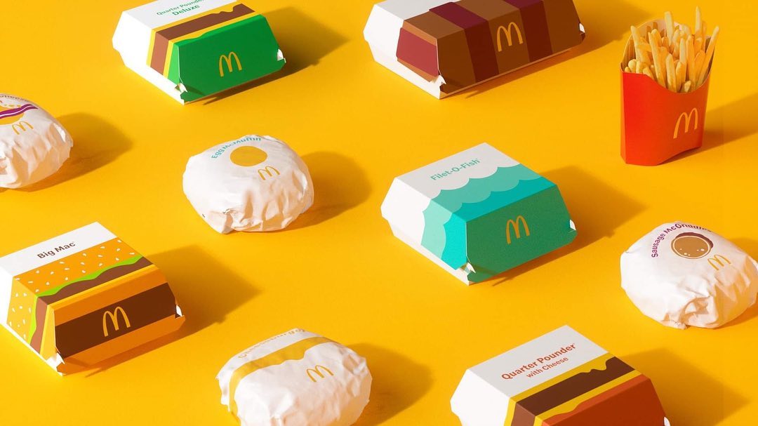
McDonald's Unveils New Retro Packaging With Playful Bold Colours, Will Be Rolled Out Globally
McDonald's is a household brand that has been consistently coming up with new offerings - remember the Pokémon Happy Meal toys and peach pie in a pretty pink?
This time, McDonald's has unveiled something new once again, but it has nothing to do with toys or food - the fast food chain has teamed up with creative agency Pearlfisher to redesign its packaging instead!
Read on to find out more!
 Photo from Pearlfisher
Pearlfisher has pulled out some of the most delicious and iconic menu items, from Big Mac® to McFlurry®, to redesign their packaging.
The renewed packaging has retro touches and bold, playful colours that will bring a sense of joy.
 Photo from Pearlfisher
 Photo from Pearlfisher
The Filet-O-Fish® packaging is reimagined with cool blue waves while the design on the Big Mac® looks like a burger.
 Photo from Pearlfisher
The Egg McMuffin®'s packaging is simple but cute at the same time, with a plain white background to represent the egg white and a dollop of yellow to represent the egg yolk.
 Photo from Pearlfisher
There's not much of a difference to the packaging for the fries, but take a closer look and you will notice that the inside of the new packaging will come printed with sticks of french fries.
 Photo from Pearlfisher
The new McFlurry packaging will come in bright pops of colours in red and pink.
 Photo from Pearlfisher
The easy-to-understand graphics will make McDonald's new packaging easily recognisable.
 Photo from Pearlfisher
The packaging for the rest of the menu has not been revealed yet, but it's safe to say they are going to look as fun as what we have seen so far!
We can expect to see these new designs in our local McDonald's stores in the near future as they will be rolled out around the world, according to Pearlfisher.
Do you like the new packaging design?
Share this post with a friend!
Text by: GirlStyle SG


