8 Pink Barbiecore HDB Flat Designs In Singapore That Look Feminine & Sophisticated
Pink has never gone out of style but we can credit the Barbiecore wave for taking the pink-session to a whole other level. The Barbiecore aesthetic looks best on bags and shoes and accessories, but why stop there? There's nothing that says 'living in a Barbie world' like quite literally living in a Barbie dollhouse!
We've found eight pink, Barbie-worthy HDB flat designs in Singapore that nail the sweet and feminine look while still keeping it sophisticated enough to sway any less enthusiastic partner. Whether you're renovating your home or gathering ideas for your future BTO, they're worth adding to your inspiration board.
#1 A Varied Mix of Pinks
 Photo from De Exclusive
This project by De Exclusive features a stylish combination of pink, luxe marble and gold accents. Pink is incorporated in each part of this open-concept home in different ways which makes each room distinctive and fresh, yet gives the entire home a cohesive look.
 Photo from De Exclusive
The foyer has a playful design with grey curved patterns against pink paintwork. In the living room, splashes of pink on the TV console wall, framed art and pillows add a delicate warmth and complements the greens of the sofa, wall art and houseplant.
 Photo from De Exclusive
 Photo from De Exclusive
The pastel pink motif continues in the kitchen through a pink herringbone tile backsplash that makes a stylish statement.
 Photo from De Exclusive
#2 Over and under in pink
 Photo from Mr Shopper Studio
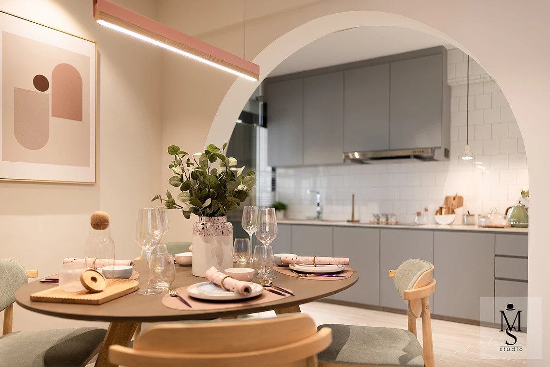
This home design by Mr Shopper Studio is an excellent example of how to use colour to create zones in a small open concept home as well as different shades of one colour to create interest.
The pastel pink ceiling defines the dining area without the use of walls or partitions. The same shade continues to the foyer cabinets' border. The white doors help avoid overwhelming the small area with too much pink.
 Photo from Mr Shopper Studio
The living room is mostly monochrome with a large dark dusty pink rug. This injects warmth to the space and ties in with the pastel pink ceiling without fighting visually with it. The entire living/dining/kitchen area has plenty of neutral shades like white and grey to provide breathing space between the pinks and keep it looking sophisticated.
 Photo from Mr Shopper Studio
#3 Go Minimalist
 Photo from Creatology
Pink is anything but childish in this HDB design by Creatology. Muted dusty pink walls, a mix of clean lines and curves and simple furniture contribute to a serene minimalist home reminiscent of an art gallery.
 Photo from Creatology
The clever use of floor-to-ceiling mirrors brightens the foyer and creates the illusion of space. While pillars are usually regarded as an eyesore, this white pillar is redesigned as a seating area while looking like an intentional decorative structure.
 Photo from Creatology
 Photo from Creatology
 Photo from Creatology
#4 Soft Greys & Luxe Velvet
 Photo from Mr Shopper Studio
This glamorous home design by Mr Shopper Studio makes a statement with a generous use of pastel pink on the living room wall and kitchen cabinets. What makes this space look classy rather than juvenile is complementing the pink with white, light grey and touches of gold and marble.
 Photo from Mr Shopper Studio
 Photo from Mr Shopper Studio
The pastel pink on the cabinet skirting extends to the dining area which brings the spaces together visually. The dining table is set in front of an eye-catching curved dark velvet pattern and mirrored wall. Grey velvet chairs and the gold tones of the light fixture and furniture add to the luxe look.
 Photo from Mr Shopper Studio
#5 Subtle Pops of Pink
 Photo from Mr Shopper Studio
For those who aren't ready to take the full plunge into pink, this HDB design by Mr Shopper Studio shows you how to incorporate pink that will be easier to change should your love for pink wane in the future.
Subtle pops of pink are added through soft furnishings like curtains, blinds, wallpaper, pillows, light fixtures and wall art.
 Photo from Mr Shopper Studio
 Photo from Mr Shopper Studio
 Photo from Mr Shopper Studio
This home design also has a pink bathroom countertop which might be a hassle to change but since it's relatively small, it's unlikely you'd get tired of it.
 Photo from Mr Shopper Studio
#6 Custom-Made Murals
 Photo from Design 4 Space
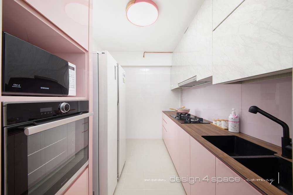
We know this is Hello Kitty, but you get the idea. This home design by Design 4 Space showcases the homeowner's love for the character without going overboard with the theming, and the same can be applied to a Barbie-themed home!
Light pastel pink is anchored by a minimalist interior design with whites and light-wash wood to create a relaxing space that doesn't look overwhelmingly saccharine.
 Photo from Design 4 Space
The highlight of the home is definitely the Hello Kitty face TV backdrop design. The pink theme continues at the TV console drawers, blinds, wall art and pillows.
 Photo from Design 4 Space
The kitchen design also balances white and pink with darker colours which helps ground the overall aesthetic with more grown-up vibes.
#7 Pink & Patterns
 Photo from The Scientist
While pink can already make a statement on its own, pairing it with patterns can amp up the look of your home even further. These home designs by The Scientist mixes dusty pink with patterns like terrazzo.
 Photo from The Scientist
 Photo from The Scientist
The terrazzo trend has made a comeback in interior design and we're guessing it's going to last. It's used in these two homes as the a dining tabletop, and kitchen countertop and back splash. The shattered mosaic look creates a striking and luxurious look that complements the dusty pink perfectly.
While real terrazzo material is quite costly, there are also terrazzo prints which is a more affordable option.
 Photo from The Scientist
#8 A Medley of Colours
 Photo from Weiken
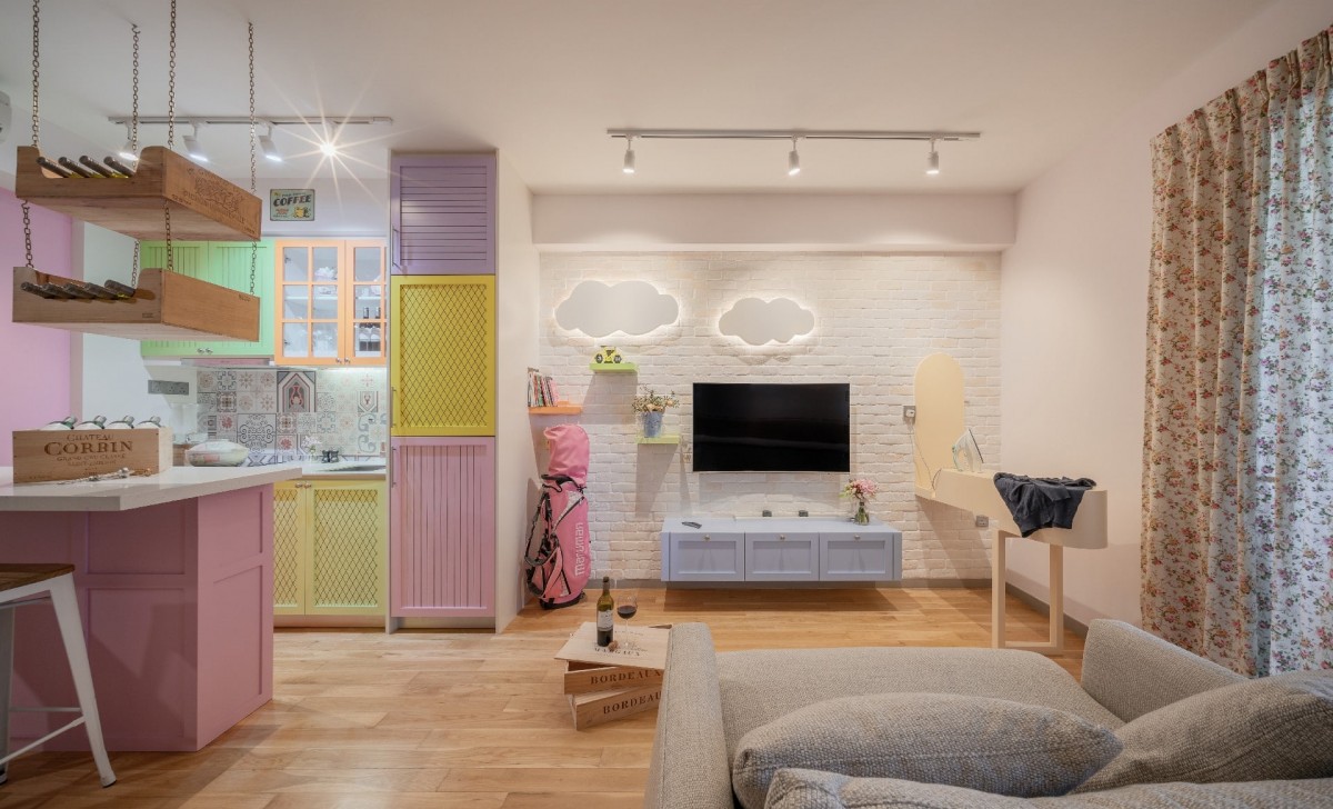
You can get the most dollhouse-like look by mixing multiple vibrant colours. It might seem daunting, but this home design by Weiken pulls it off effortlessly.
The home manages not to look visually cluttered by keeping most of the space in neutral colours. The bold colours are primarily used in the kitchen with pops of pink, yellow, purple, orange and green. The wooden flooring creates balance with the bright colours and emphasises the cosy cottage look of the kitchen cabinets and ceiling-hung crates.
 Photo from Weiken
 Photo from Weiken
While you're here, check out the coolest and most atas condos in Singapore that have giant slides, car lifts and more.


