





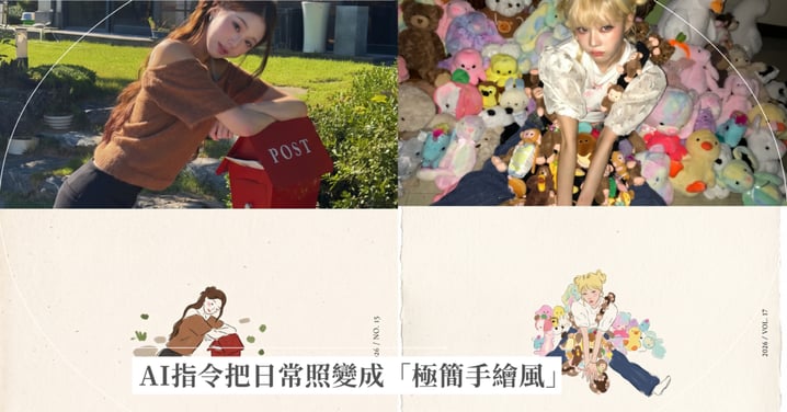
把日常照變成「極簡手繪風」!AI指令讓你一秒帶出藝文感,完整指令一次公開!
想讓社群照片擺脫千篇一律的濾鏡,秒變充滿藝文風格的精裝封面嗎?這款「照片轉半畫半照獨立藝文海報」AI指令,將為你的 IG 視覺注入質感靈魂~不只保留了原本的照片,也轉換出充滿藝文風格的繪圖,讓人耳目一新~
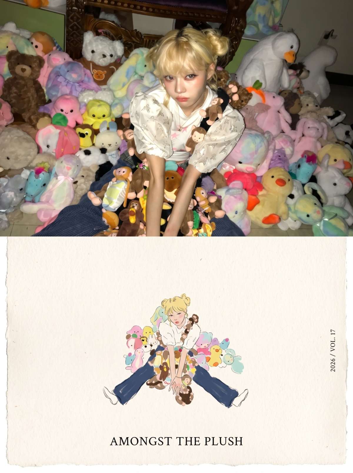 Photo from IG@imwinter
✨ 50/50 畫照對比: 上半部保留 100% 照片的真質感與精緻光影;下半部將人物與經典動作簡化為 10–20% 的精巧手繪插畫。
✨ 精緻手作質感: 帶有微微瑕疵的墨線、壓克力質感平塗,搭配暖白粗糙紙張紋理,營造安靜且充滿詩意的文青氛圍。
✨ 簡約和諧色彩: 自動萃取照片中的 4 種核心色彩,結合極簡襯線體排版,張張都是名牌雜誌感!
不論是拿著花朵、吃著草莓,還是街頭漫步的日常,都能一秒轉化為屬於你的視覺詩篇集。
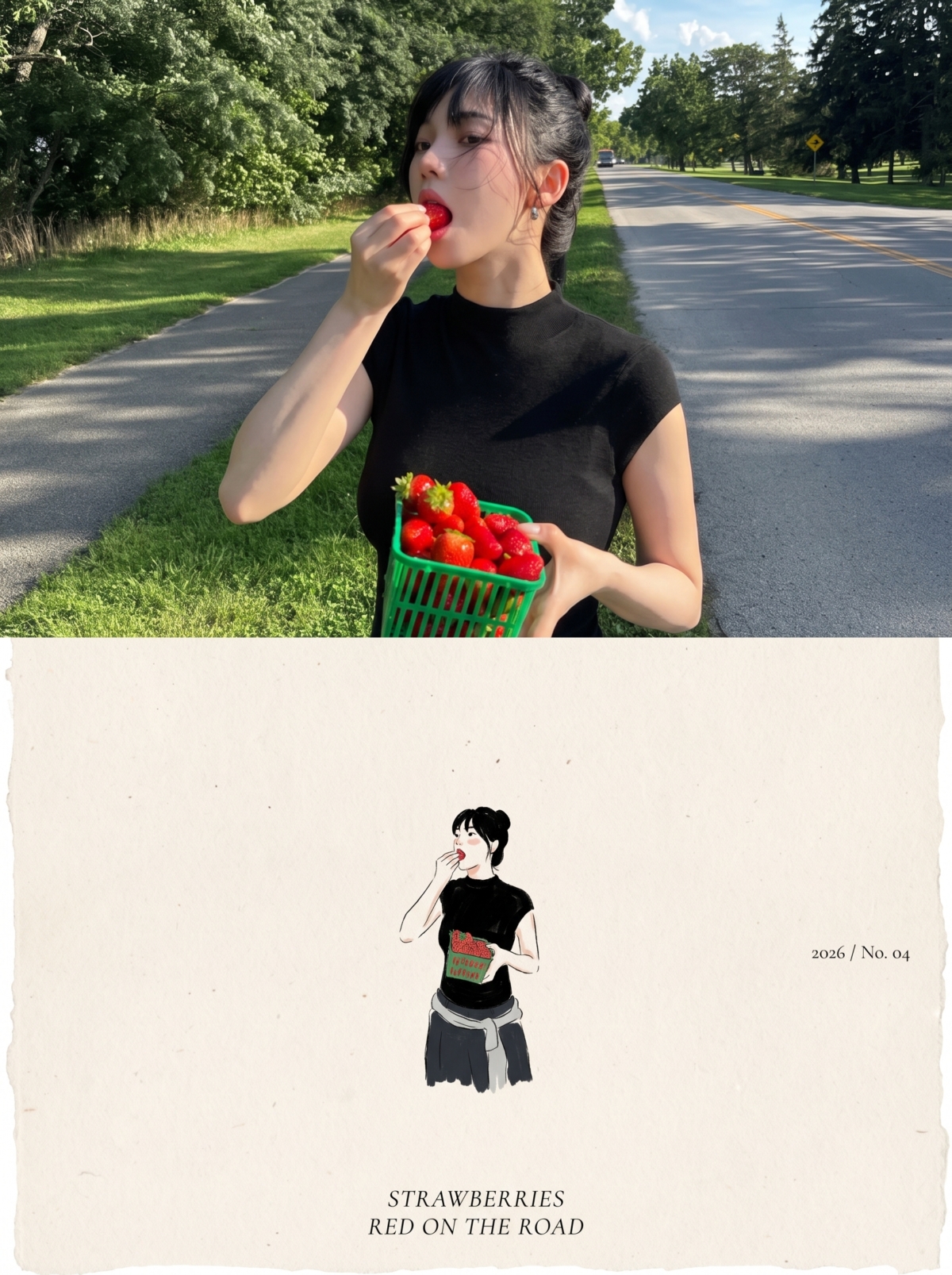 Photo from IG@katarinabluu
請上傳一張照片,並複製以下完整指令:
Create one independent high-end editorial poster for each uploaded photo. Do not combine multiple photos into a collage. Each photo must be processed and output as a separate poster.
OVERALL FORMAT
Strict 3:4 vertical composition.
Divide the canvas horizontally into two exactly equal sections, with a precise 1:1 height ratio.
The top half occupies exactly 50% of the canvas.
The bottom half occupies exactly 50% of the canvas.
The two sections should feel visually connected as one refined art publication cover.
TOP HALF — ORIGINAL PHOTOGRAPH
Preserve the original photograph as faithfully as possible.
Keep the main composition, subjects, identity, facial features, body proportions, poses, expressions, clothing, objects, and spatial relationships unchanged.
Preserve the realistic photographic texture, natural lighting, shadows, atmosphere, and original color mood.
Apply only subtle, sophisticated editorial color grading, creating the feeling of a premium magazine photograph, contemporary art book, or high-end independent publication.
The image should remain photorealistic and authentic, never overly retouched or artificially stylized.
If necessary to fit the 3:4 composition naturally, extend the sky, ground, walls, or surrounding environmental background.
Background extension must feel seamless and photographic.
Never stretch, distort, reshape, replace, or alter the main subject.
BOTTOM HALF — MINIMAL HAND-DRAWN PAPER ILLUSTRATION
Extract the most recognizable visual elements from the original photograph and reinterpret them as a minimalist hand-drawn paper-cover illustration.
Preserve:
The most recognizable subject
Essential silhouette and proportions
Key pose or gesture
Important objects
The core narrative relationship between people and objects
Highly simplify the image. Remove unnecessary details and retain only the visual information needed for immediate recognition.
Use:
Delicate, slightly imperfect hand-drawn lines
A small number of bold, clearly defined acrylic-style flat color shapes
Rough paper texture
Visible handmade brush marks
Slightly irregular, organic edges
Subtle imperfections that make it feel genuinely handmade
The main illustrated subject should be small, centered, and carefully composed, occupying approximately 10–20% of the bottom half.
Leave a large amount of negative space around the illustration.
The background should primarily resemble:
Rough white paper
Warm off-white paper
Pale natural paper
Minimal editorial book-cover stock
Use only a few lines or small color shapes to suggest the surrounding environment.
COLOR PALETTE
Extract the dominant colors directly from the original photograph.
Compress the palette into no more than 4 main colors.
Keep the colors restrained, sophisticated, and harmonious.
Use bold but controlled flat color blocks.
Avoid excessive color variation.
Preserve subtle paper grain and handmade brush texture.
The illustration should visually feel like a simplified color interpretation of the photograph.
TYPOGRAPHY
A small amount of simple typography may be included when appropriate.
Possible elements:
A short title
Keyword
Object name
Location
Year
Number
Short phrase
Text should be minimal, understated, and editorial.
Typography should naturally interact with the large areas of negative space and the small illustration, evoking:
Art book covers
Independent publishing
Contemporary editorial design
Thoughtful children's picture books
Do not force text into the composition if it does not naturally fit the photograph.
VISUAL LANGUAGE
The final poster should feel:
Quiet · Poetic · Refined · Minimal · Innocent · Relaxed · Artistic · Thoughtful · High-recognition · Premium
The visual concept should be:
“A small subject surrounded by a large amount of empty space.”
The result should resemble a carefully designed independent art publication cover, rather than a commercial advertisement.
AVOID
Do not use:
Colored-pencil aesthetics
Crayon textures
Bleeding watercolor
Pure line-art illustration
Complex realistic illustration
Heavy oil-painting effects
Smooth polished digital illustration
3D rendering
Glossy 3D textures
Commercial cartoon aesthetics
Cute commercial character design
E-commerce advertising aesthetics
Generic poster templates
Excessive decorative elements
Busy compositions
Excessive typography
FINAL ART DIRECTION
The top half should feel like a beautiful, authentic editorial photograph.
The bottom half should feel like a small, handmade visual poem derived from that photograph.
The two halves should clearly belong to the same visual story, while maintaining a strong contrast between photographic realism above and minimal handmade illustration below.
Prioritize recognition, restraint, negative space, material texture, subtle imperfection, editorial sophistication, and artistic storytelling over decorative complexity.
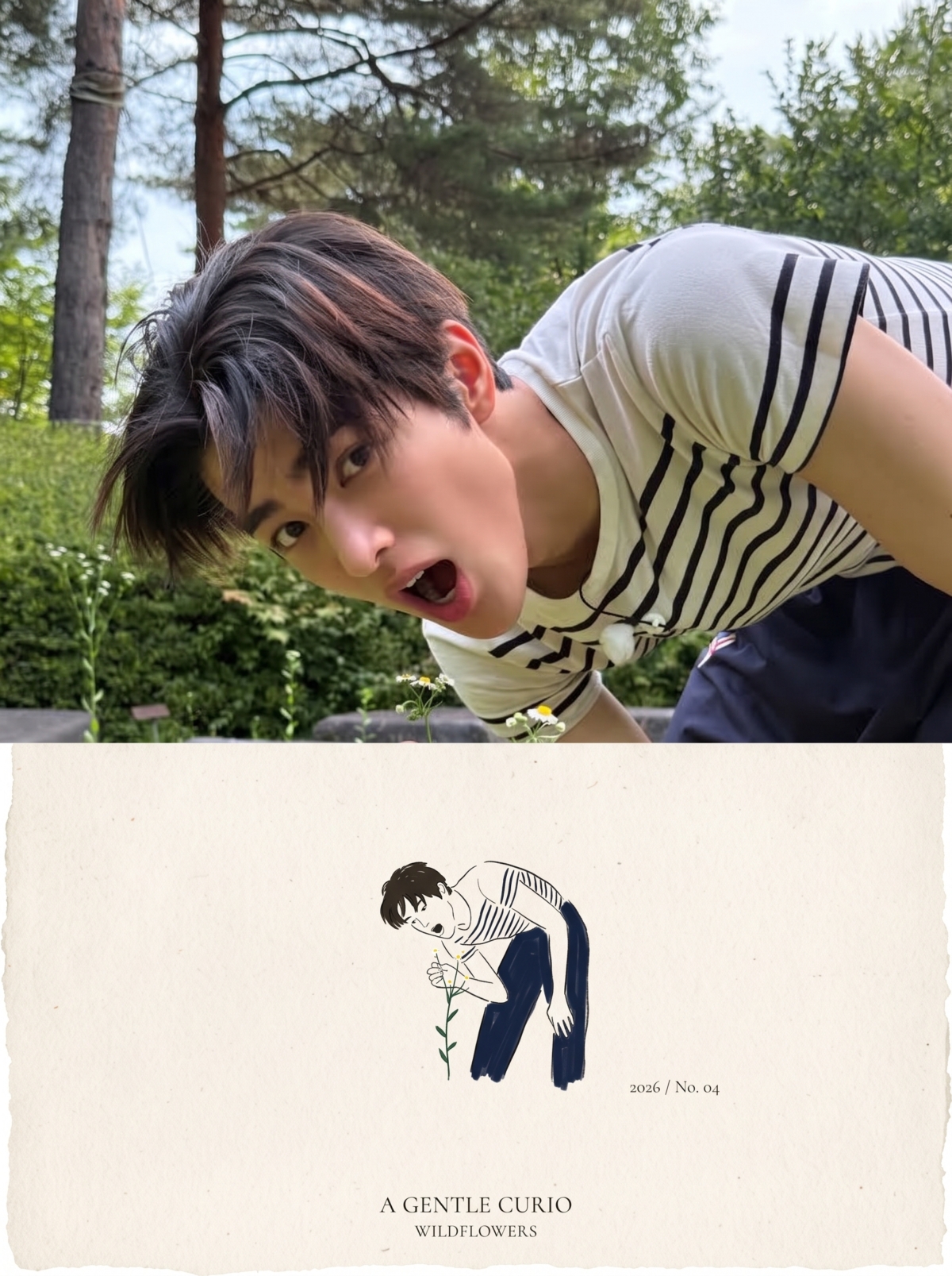 Photo from IG@cortis
By 台灣女生日常編輯部


